
Inside: Explore Sketch 160A by Wassily Kandinsky with your students and have them create an abstract art project in this Kandinsky art lesson!
Hello there! I am excited to announce that Amanda Koonlaba of Party in the Art Room is now a contributing writer here at Art Class Curator. Please enjoy her first post–a Kandinsky art lesson inspired by Kandinsky’s Sketch 160A! Thank you, Amanda, and I look forward to more art learning with you in the months to come! — Cindy

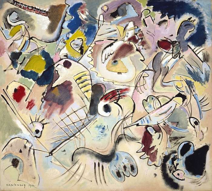
Wassily Kandinsky wanted viewers of his work to react both emotionally and spiritually. He used carefully nuanced colors and quizzical lines to evoke this sort of response in the viewer’s soul. Eventually, Kandinsky would begin to work in pure abstraction, but here some elements of the natural world are evident.
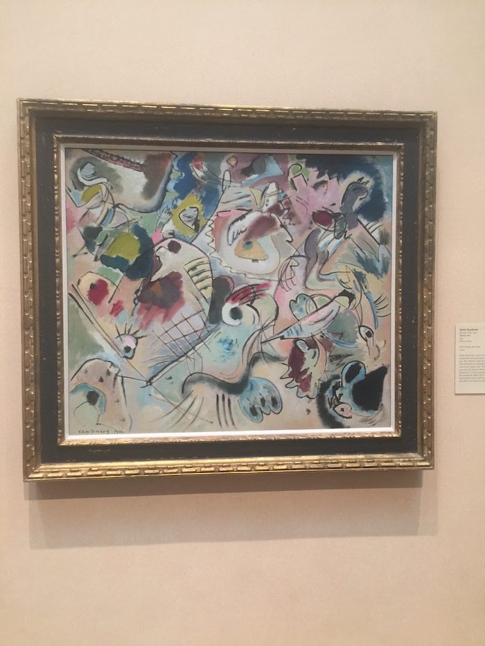
This work of art lives at the Museum of Fine Arts Houston. I was fortunate to make the ten-hour drive to Houston in the summer of 2017, before the devastating hurricane hit, to visit this wonderful art museum. Of the hundreds of works I was able to view there, this one really stuck with me.
Here is the image I took of the way the work hangs on the wall in the museum. It is relatively small. The dimensions are just 46 1/4 × 52 × 3 3/8 in.
Please note, this post includes Amazon affiliate links. As an Amazon Associate I earn from qualifying purchases.
Let’s Take a Look
Any good Kandinsky art lesson should begin with analysis. So, let’s dig in and take a deeper look at this work.
Kandinsky used nuanced colors. These colors are subtle, and if taken individually, perhaps a bit bland. Combined in the work, however, the colors perfectly capture the context of the image. The pastel colors help to illuminate the image while the darker colors provide a sense of depth. The pastel and darker colors work together to make the viewer feel a sense of dread. This work was created on the eve of WWI, a time when worldwide turbulence evoked fears of an apocalypse in the masses. While the lines of the work seem haphazard at first glance, Kandinsky has actually included imagery of the apocalypse here.
Here are some discussion questions to use with students:
- Describe how this artist uses color.
- Which colors illuminate the work?
- Which specific colors are used to give the work depth?
- Which colors create contrast?
- How does Kandinsky use white and black in this work?
- What images do you see?
- Can you find the horse and rider?
- Can you find the birds, mountains, and fish?
- What is the mood/feeling of this artwork? What choices did the artist make to you feel this way?
- What images of doom do you see?
- Does any part of the work make you feel more doom than the other parts?
- Which part of the artwork gives you hope?
Kandinsky Art Lesson
Now that the students have analyzed the work, it is time to create.
Materials:
- Black oil pastels
- White oil pastels or crayons
- Tempera cakes
- Paintbrushes
- 12×18 off-white tagboard
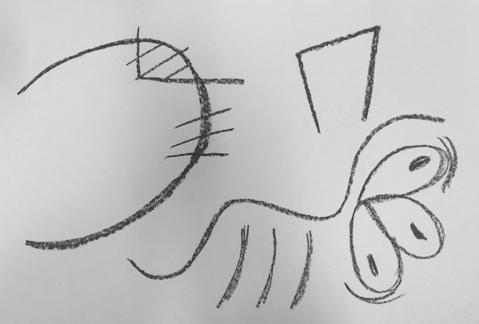
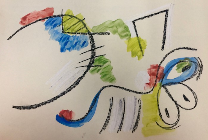
Step 1: Have students draw 15-20 haphazard lines on their papers with a black oil pastel. Be sure to tell the students that while their lines should appear haphazard, they should be very intentional about what they are drawing. They can include abstracted natural forms as well (like Kandinksy’s bird and fish).
Check out this abstract art lesson for an easy way to talk to students about abstraction!
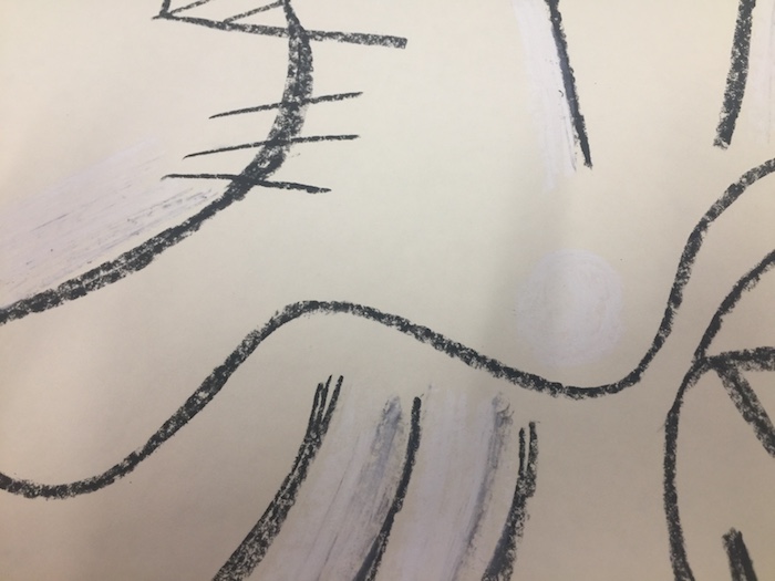
Step 2: Have students add white oil pastels to about 5 areas of the work. They can hatch and crosshatch. The photo below is up close to show the haphazard, yet intentional, way the white was added to the work.
Step 3: Have students paint in random sections wherever desired. They can paint loosely with the brush. The paint can go over the oil pastels. They should leave some sections of the off-white tagboard showing. They can use as many colors in as many places on the page as they’d like, but tell them to make some of the colors dark and some brighter.
Wrapping Up
When my students finish their own creations, I like to have them analyze each other’s works in a similar manner to how they analyzed the master’s work.
Here are some questions they can ask each other:
- Which specific colors are used in the work?
- Why do you think the artist chose those colors?
- Which colors contrast?
- How did the artist use white and black in this work?
- Where can you find symbolism in the work?
- Which parts of the work make you feel doom or dread?
- Which parts of the work give you hope?
Let’s Connect
Do you have other ideas for a Kandinsky art lesson? I’d love to hear them. Be sure to comment here with your thoughts. I’ll be checking in.
Also, check out Party in the Art Room where you can find related Kandinsky art lessons to teach other subjects:
Until next time!
Amanda


Thank very much for this. I have also worked on a Kandinsky project with my Montessori nursery students and we enjoyed it tremendously.
This site will help me extend and link more Kandinsky process art to the lesson plans.
All the best!
Hey Daisy! I would love to hear more about that project. I have a little preschooler in Montessori right now! Thanks for the comment.
Sketch 160A is in the Museum of Fine Arts, Houston. My students like when I show them art close to them.
Yes! It’s so cool to discuss something in class and then get to see it in person. Makes it more “real.” And, they get the experience of being able to compare the digital version versus the real life version.
That’s a great museum. I hope I get to go back one day.